Before we start any design work for clients, we do our research. Through our research, we begin to see similarities in the solutions used throughout websites that we feel are examples of superior design. With these examples trends begin to emerge, so here’s what we feel will be the top web design trends of 2015.
Responsive Continues
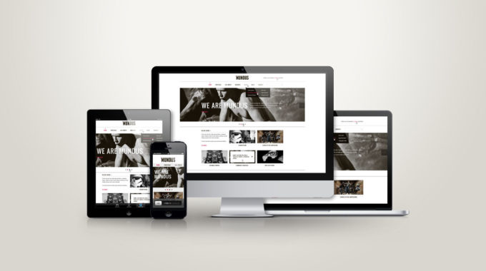
As the number of screen sizes grow, making your website responsive becomes crucially important to the success of your business. With 86% of customers researching products or service online before making their purchases, you need to make sure your website is not only easy to find, but easy to use.[1]
Typography Takes Over
Before, web designers were limited to using basic system fonts in their designs. Now, with services like Google Web Fonts, we have more freedom when it comes to font usage in our designs. This allows beautiful typography to take center stage, and present compelling content in a creative way. Also, watch for larger type, which translates well to mobile devices.
Flat Design Matures
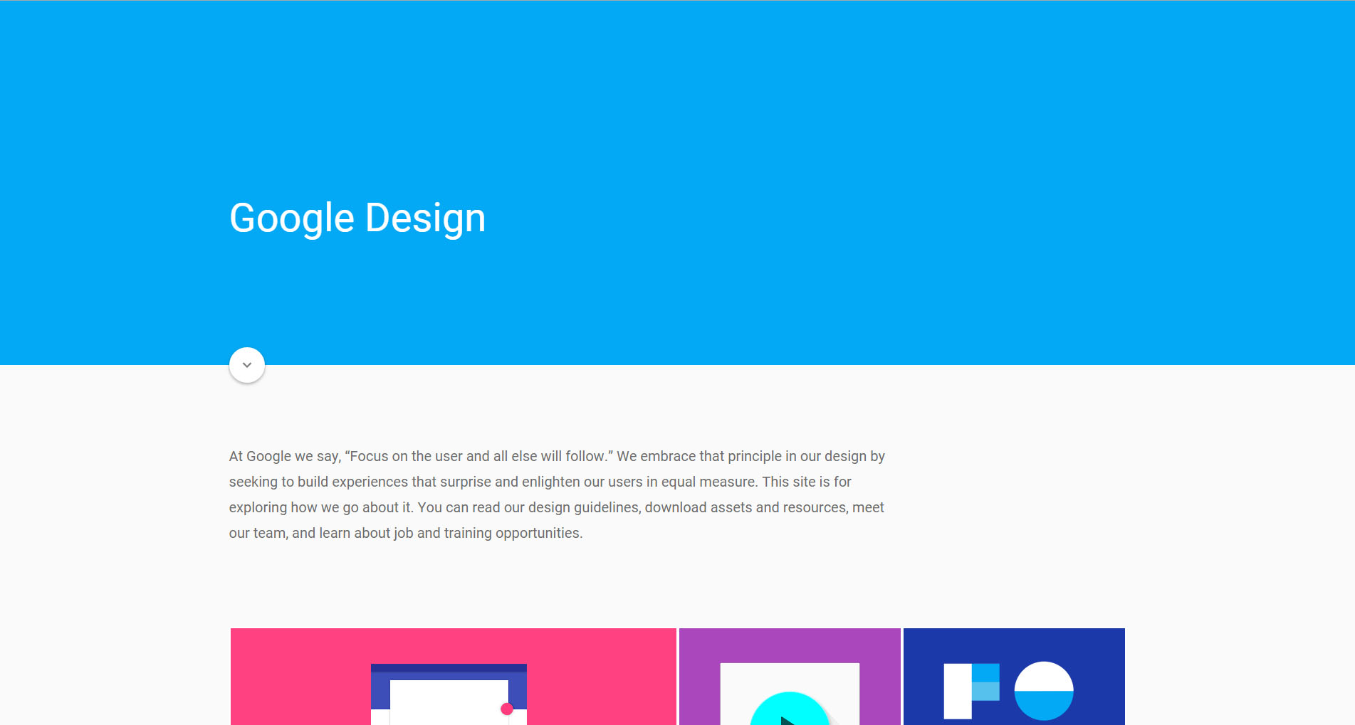
Flat design will continue to reign supreme. It allows for faster load times, and favors a modular appearance. However, it will take on a slightly more detailed appearance. Google created a new design language, material design, which is featured in the latest Android operating system. The style expands upon the principle of flat design, but implements subtle shadows and gradients to create some depth.
Card Design
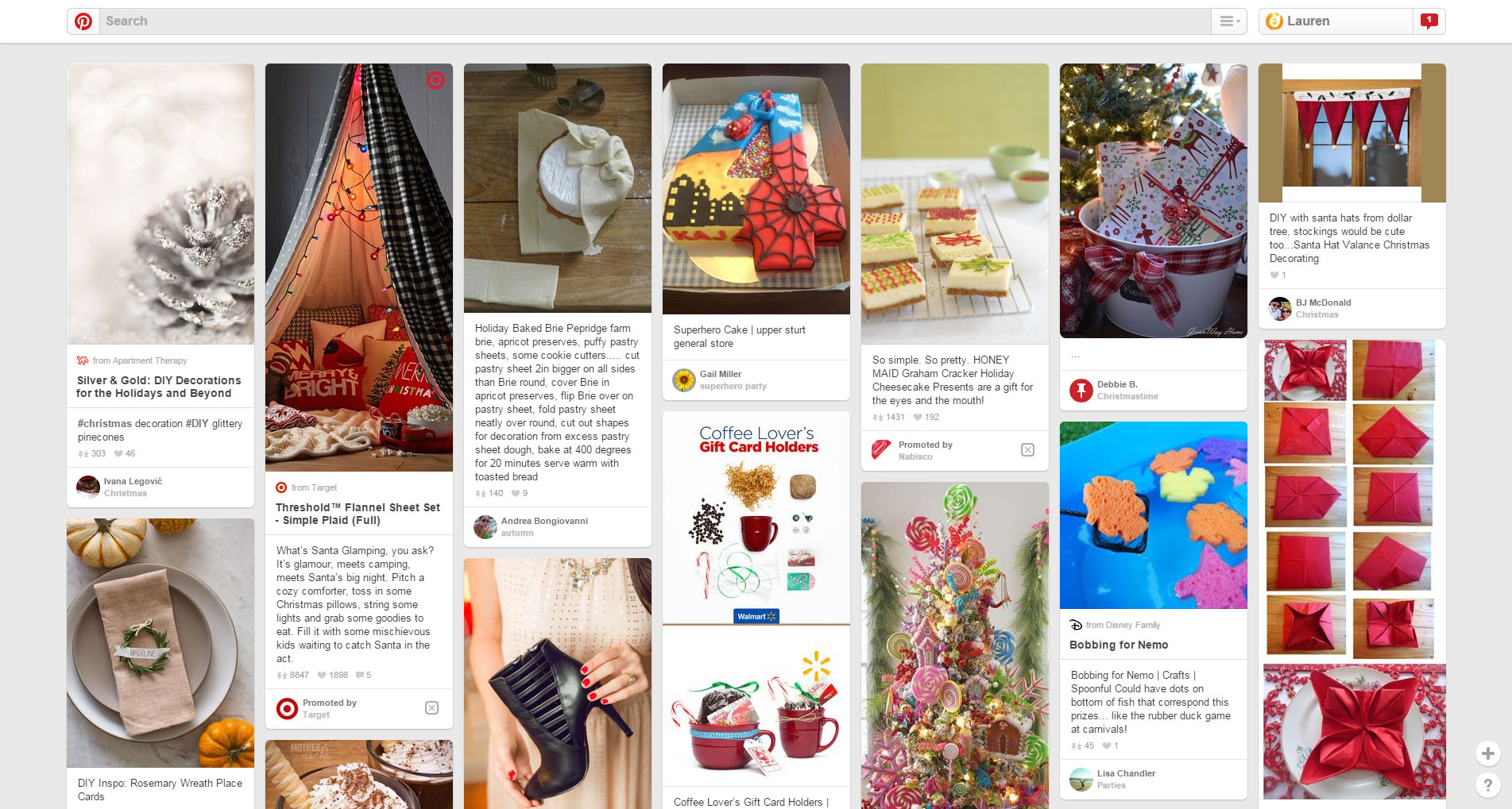
This design style allows you to serve your viewers snippets of easy to digest content, which is also easy to share. This design style grabs attention because it is typically image focused with limited text. Also, card design is modular, which means that it adapts to any device.
Scrolling Over Clicking
With mobile devices and touch screens moving ahead of the standard desktop, scrolling is preferred over clicking. This means that viewers favor websites that feature a continuous scroll vs. those which require them to click through the website. No longer is it important to have your best content “above the fold” as users have become more comfortable scrolling through a website to explore all of your content.[2]
Storytelling with Parallax Design
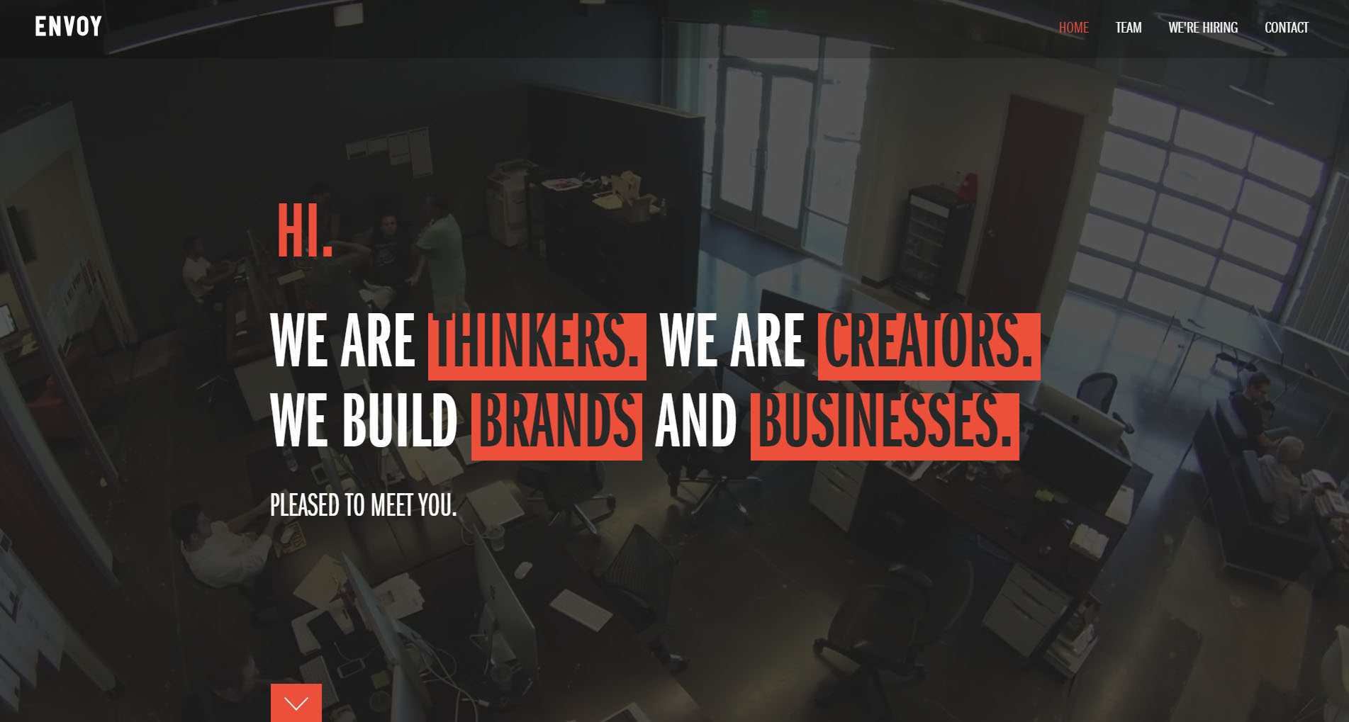
Parallax design is a scrolling effect where the background moves slower than the foreground. This technique gives your website a 3-dimentional feel. When used appropriately, your website can tell a dynamic story as viewers scroll down your website.
Full Width Images & Videos
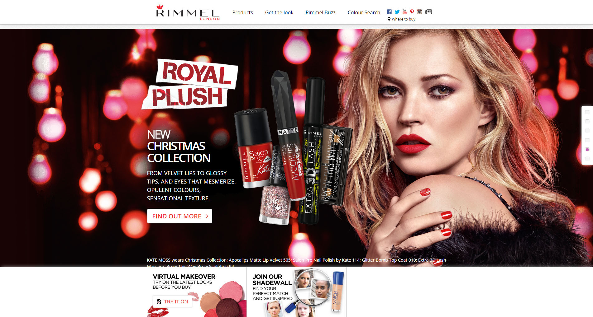
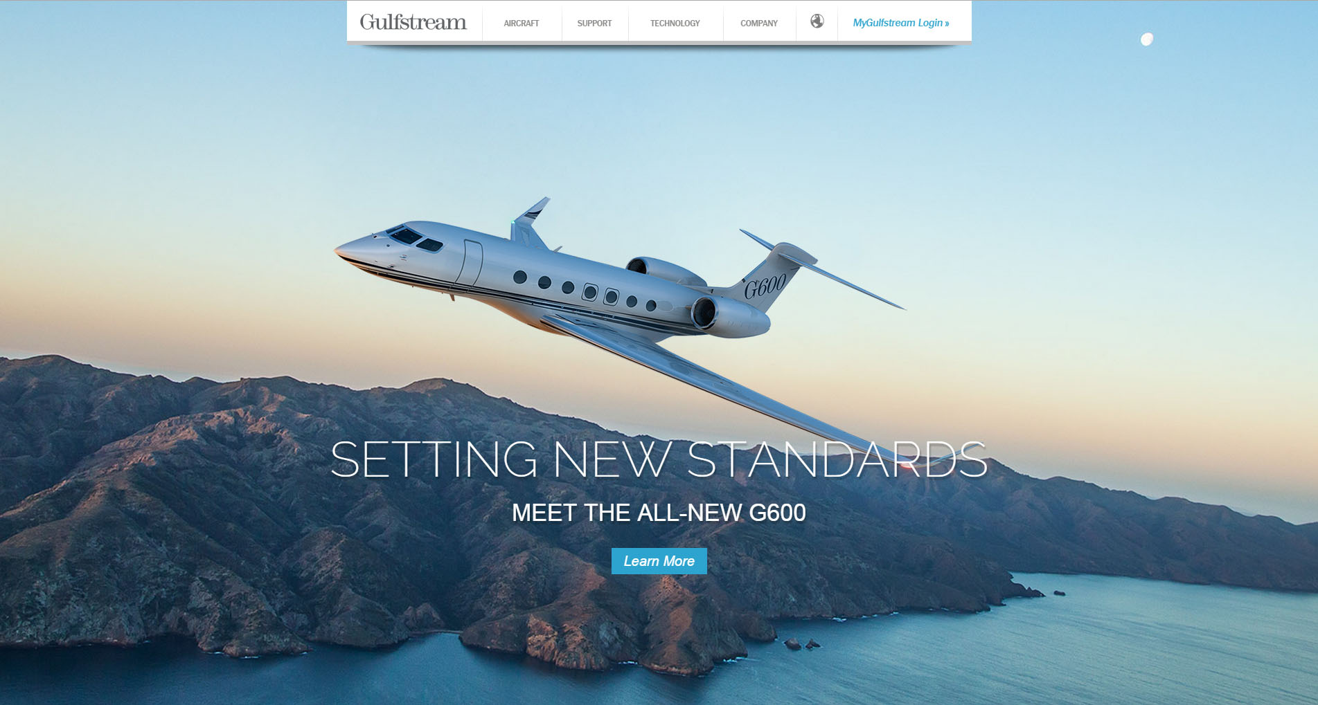
Beautiful photography that represents your brand will make a statement when it spans the entire width of your screen. When executed correctly, large scale photos and videos will enhance your messaging, and set the tone for your entire website.
What web design trends are you interested in featuring on your website in 2015?
[1] http://www.mediapost.com/publications/article/160988/web-influences-trillion-dollar-retail-sales.html#axzz2a0Th0me7
[2] http://www.cxpartners.co.uk/cxblog/the_myth_of_the_page_fold_evidence_from_user_testing/

